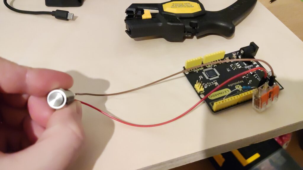
Our approach to the problem of navigating
the digital pillar
When the team of the “digitale Litfaßsäule” project (a digital community pillar that is supposed to bring the local community together) presented their idea and possible problems that still need solving, our team immediately had an idea how to solve one of these problems – the navigation of the digital community pillar.
The guys presented the idea of navigating the pillar with around 5 buttons, as a touchscreen would not be safe enough from vandalism. However, they were unsure how to properply make use of the buttons.
Our team had the idea: label the buttons dynamically to get more mileage out of the limited inputs.
Our first brainstorming about our target groups
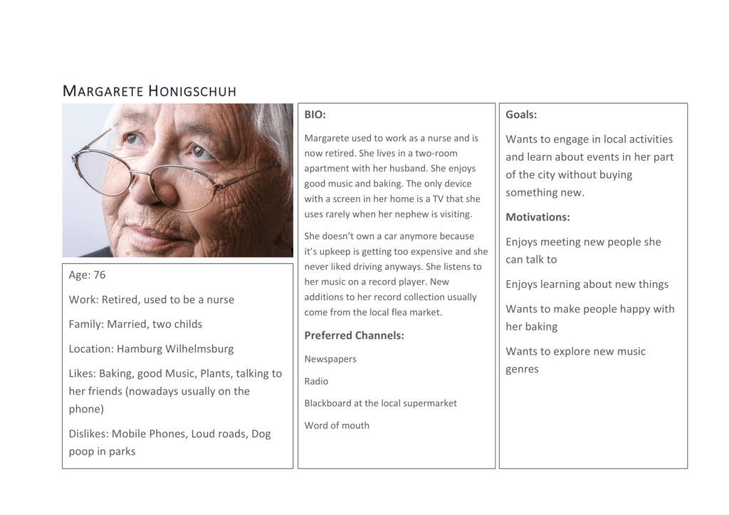
We developed the persona Magarete Honigschuh among others..
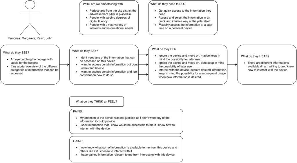
.. and created the empathy map and thought about user stories and so on
Our first solution approach with the target groups in mind
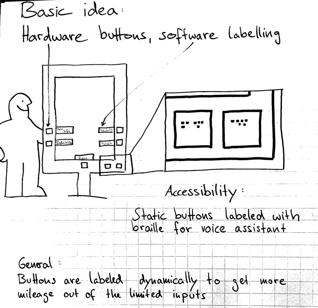
With the importance of accessibility – for all – in mind, we sketched out our first, basic idea. We presented and consulted with other groups and even shared our approach with one of the original team members of the “digitale Litfaßsäule” project.
As everyone seemed very pleased with our idea, we continued on with our approach and used the inputs in school to develop a proper prototype with Adobe XD and 3D print a casing for the 5 buttons which will connect to our Adobe XD mock-up version of the digital community pillar screen.
The buttons will be connected through an Arduino to our laptop, so that we can use them properly with our Adobe XD screen mock-up and most realistically represent how it would work in the real-life version of the pillar.
Impressions of our process

Adobe XD worked perfectly with what we had in mind. It was a matter of getting all of our ideas together and working properly, but we did not face any major issues along the way – everything worked as we imagined and we were very happy with our vision finalized.
Our final thoughts
As we iterated over our process several times, we figured out some things wouldn’t work as imagined, or simply weren’t a priority yet, as it’s not even sure if those will be realized (like a text-to-speech-converter) and we wanted to keep our focus mainly on the buttons themselves. We also had ideas on how to expand on our idea, however due to our limited time, those are also reserved for the future.
We prioritized based on the MoSCoW-Method:
- Must
- Should
- Could
- Won’t
Our Musts: a vandalism proof and cost-efficient input method that is accessible to the widest possible range of people, i.E. people without a smartphone to scan QR Codes, people with a disability, blind people, children etc..
Our Shoulds: Creating an intuitive UX design for less tech-savvy people
Our Coulds:
Our Won’ts: Text-to-speech in/output for blind people
Summed up
We had a lot of fun working on this, visualizing the idea and prototyping it, and we’re very happy with our outcome. We sincerely hope that this will benefit the project and may be of use in the final digital community pillar that will eventually adorn the city streets.
We hope you also liked our idea, thank you for reading and we’re happy to hear feedback from you!
Your Team DingsBums
(Tobias, Markus, Anton, Nicole)
